

Friday, December 25, 2009
Wednesday, December 16, 2009
Too Many Caroling Commercials
Why do all advertisers find it necessary to make caroling commercials for the holiday season? The only one that may have been funny and I didn't see was a Dunkin' Donuts one with those clever and relevant anecdotes about life they create. Here's just a sample of the lame commercials featuring carolers.
Best Buy Twelp Force Carolers - I find myself especially annoyed by these carolers and I'm not sure why. This guy agrees with me. Watch for yourself...if you must.
TJ Maxx & Marshall's Carolers - I don't hate them as much, but the whole caroling-exploited-for-advertising is definitely getting old.
Any other companies out there annoying the masses with their faux Christmas songs?
Wednesday, November 25, 2009
Funny Malibu Rum commercials
I always loved the "Do you want to be a fisherman?" Malibu Rum commercial from their "Seriously easy going" campaign.
The newer campaign - Mali 'Boom Boom' radio - is pretty good too. Definitely makes you want a Malibu rum drink or at to least dance:
The newer campaign - Mali 'Boom Boom' radio - is pretty good too. Definitely makes you want a Malibu rum drink or at to least dance:
Monday, November 23, 2009
Unique uses of QR codes
A QR code is basically a bar code that contains encoded content that can be scanned by most cell phones. The cell phone needs to have a camera and internet capability. It has actually been around since 1994 and is highly popular in Japan, but is just gaining traction and greater awareness in the US. To use it:
Get the nutrition facts on your mobile with a QR code.
- Just download a QR reader to your cell phone, like NeoReader or Kaywa
- Take a picture of the QR code - the embedded content is decoded at a high speed and sent to your phone. Things that can be embedded include website links, short text messages and phone numbers.
Get the nutrition facts on your mobile with a QR code.

Advertising call to actions.


Get destination info sent to your phone before leaving the airport.

A living book of QR codes
Tuesday, November 17, 2009


Monday, November 16, 2009


Thursday, November 12, 2009
Promoting coffee with art or promoting art with coffee?
 Grinders coffee just participated in a great outdoor stunt experimenting with coffee as art. They used 3,604 cups of coffee to recreate the Mona Lisa in Sydney, Australia. The process took cues from the pointillism style of painting, which uses small dots to create the illusion different shades and colors. The artists treated every cup as a dot of their "painting" and filled each with different amounts of milk to create the variety of shades. Who knew milk could also be white paint?
Thanks Clive for sending the pics!

Thursday, November 5, 2009
Commercials that make you go hmmmmm...
All too often commercials are disguised as ads that are "educating" consumers, but the messages and claims are just too outrageous to allow any viewer to perceive the ad as genuine. Two recent examples of these types of ads come from the Corn Refiners Association and America's Natural Gas Alliance.
The Corn Refiners' "Sweet Surprise" campaign attempts to highlight high fructose corn syrup as an equivalent to natural sugar by stating that just like sugar, it is "fine in moderation."
The campaign also plays off the fact that many people may not be able to verbalize why high fructose corn syrup is known as detrimental to your health. Well, this spoof video response clears that all up, with documented proof as to why HFCS is an unhealthy chemical. Too bad for the corn refiners, but you can't pull the wool over my eyes.
America's Natural Gas Alliance developed a campaign of Eureka Moments showing "real" people against a blue backdrop describing when they first realized that natural gas was the answer to all our energy problems (Eureka!). My major issue with this campaign are the ridiculous lines within the scripts including, "Sure solar and wind energy are part of the future, but it's not always breezy and the sun sets".
Another commercial from the campaign shows a mother holding her young child and enthusiastically proclaiming that there is a whopping 100 years of natural gas supply available in the US. Yet I wonder, is 100 years really that long in the grand scheme of sustainability and the energy crisis?
Thursday, October 1, 2009
Veuve Cliquot - An Accesible Luxury

This mission is truly applied throughout all the brand touch points. The merging of historical experience with innovation is done really well, allowing them to maintain the status of an established authority in viniculture while still being accessible to consumers. They enjoy the benefits of a long history without becoming an outdated luxury brand.
Visually, Veuve Clicquot stands apart from other champagnes with its signature orange color. Similar to the Tiffany blue box, the Clicquot orange packaging has become a symbol of status and is easily recognizable at public events and on consumer displays in liquor stores.
The Veuve Clicquot website further reinforces the brand as the leader in champagne and a top authority on wine making and tasting. There is a series of videos showing how to properly store the champagne, open and taste it.

Veuve Clicquot is involved with many new media initiatives as well as co-branding opportunities to remain top of mind with luxury consumers, particularly the younger demographic interested in art and design. Some partnerships have included a champagne bar at Harrod’s in London, collaborating with top designers on innovative box types and wine storage devices, and inviting top bloggers for tours and tastings.
The melding of old and new allows Veuve Clicquot to appeal to those aware of its history and status, as well as to those who may not. The brand has achieved the difficult task of interesting the future generations, while not alienating the current elite. They have made this champagne the most accessible and recognizable “luxury” champagne.

Monday, August 24, 2009

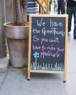
Sidewalk Chalkboard Ads - The good and the bad
There is a flower shop right outside of where I exit the subway every morning that uses a sidewalk blackboard with promotional messages. Recently, the cleverness of the messages and quality of the design has gone down significantly, so I can only assume that the witty copywriter no longer works there. For a brief time, it would really brighten my day after riding that miserable subway and even once convinced me to use their services.
When done well, a sandwich-board-style chalkboard or message board can be a cheap easy way of targeting local customers. Just as with all other marketing messages, you should add your brand's signature touch or flair to this basic promotional medium.
Good use of sidewalk chalkboard ad space from a flower shop:
Questionable use of sidewalk chalkboard ad space from a dive bar:

When done well, a sandwich-board-style chalkboard or message board can be a cheap easy way of targeting local customers. Just as with all other marketing messages, you should add your brand's signature touch or flair to this basic promotional medium.
Good use of sidewalk chalkboard ad space from a flower shop:

Questionable use of sidewalk chalkboard ad space from a dive bar:

Monday, August 10, 2009
Design Tip #1 - Know the trade abbreviations
Here are a few key abbreviations that you should know if you're going into the design or advertising field. Feel free to comment with additional ones I missed:
RFP - Request for Proposal - This comes up with any new business pitches in advertising.
FPO - For Placement Only - This is used in layouts when an image hasn't been selected yet or you are waiting for a high resolution version.
DPI - Dots per inch - This is in reference to image file resolution. Two standard sizes are 72 dpi, which is low resolution and used for websites and on screen imagery and 300 dpi, which is the minimum resolution for images that must print.
PPI - Points per inch (same as DPI)
FTP - File Transfer Protocol - This is the best way to send large files and is necessary to use when uploading website files to a hosting server. When working on a PC, the IE browser should work as an ftp program, but on a Mac you'll need a program. The most commonly used programs are Fetch and Cyberduck.
Friday, July 31, 2009

Thursday, June 18, 2009

Sunday, May 24, 2009

Friday, April 24, 2009


Sunday, February 15, 2009
What the heck is Twitter and why should I care?
Well if you are in the marketing industry or any industry where networking and PR is essential, you really should be on twitter or at least know about it. Twitter is a free service that allows users to post anything they are doing or thinking about with one catch...you have to do it in 140 characters or less. Of course, there is no limit to how many times you can tweet a day, and this can become a problem for the overzealous.
The twitter phenomenon has developed into two very unique forums, which I will refer to as Twitter.1.1 and Twitter.1.2. Both of these versions coexist together, but really have very different purposes.
The first, Twitter.1.1, is the version that most people have trouble wrapping their head around. This is where twitter has become an outlet for everyone to tell the world about everything they are doing, regardless of how ridiculous. For instance, one tweeter said "Fact of the day: I just ate 11 servings if apple sauce. :-D I'm happy now. I feel accomplished..." Yes, I probably could have lived my live without knowing that, even if I am your friend. This video sums up Twitter1.1 pretty well.
The second, Twitter1.2, has developed into a new medium for businesses to get special offers, tips, events and messages out to customers (followers in the twittosphere). This format becomes a valuable asset and great tool when used correctly. For example, I follow the companies I am interested in and want to hear from, and as long as they keep the posts (tweets) relevant and don't overwhelm me, I'm probably a follower for life. In this capacity, the twitter home page has become a quick easy way for me to catch up on all the things I'm interested in, without having to check through every email newsletter. The best past of twitter is that the long-winded are forced to be clear and concise. Get the special out and let people click a link if they want more information!
In conclusion, as an individual experimenting in Twitter1.1, have fun with it, but maybe stop and think, 'Would I want to know this about those I am following on twitter?' If the answer is no, skip the tweet for now. As a business, delving into Twitter1.2, keep your posts relevant to your target market and keep your company top of mind. Start a following by following others and putting a lonk to your profile in all online communications. Perhaps even consider an exclusive promotion to only Twitter users. "First 5 tweets back to this message get 25% off!"
Oh, and of course, follow me on twitter!
Saturday, February 14, 2009
Strawberry Tuxedo Man
We got some extra special chocolate covered strawberries today for Valentine's Day and I decided to turn my tuxedo strawberry into a strawberry man.


Sunday, February 1, 2009
Dunkin' Runs on Neon

Dunkin' Donuts has done a great job with rolling out their latest campaign 'America Runs on Dunkin'. I thoroughly enjoy their commercials. But, what has struck me most recently, was that they have somehow accomplished gaining a sort of brand ownership of their instantly reconizable neon pink & orange colors. I first noticed this when I was sent an invitation from a magazine that had used the same colors in their layout. My first thought was "Why did they use Dunkin' Donuts' colors?" Maybe soon we'll call these hues, 'Dunkin' Pink' and 'Donut Orange', just like we all lovingly refer to 'Tiffany Blue'.
Subscribe to:
Comments (Atom)

